
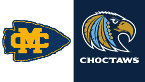
Mississippi College unveiled two new logos during this past weekend’s Homecoming.
The traditional “MC” letters have received what the school calls “a nuanced adjustment, with clean, symmetrical lines, sharp, thin edges, and a more modern look.”

The Division II school’s new main athletic logo, on the other hand, features an eagle adorned with feathers and diamond shapes modeled after Choctaw culture, moving away from the arrowhead with the MC letters on top.
The new logos, which are part of a new branding initiative at the 197-year-old Christian university, is intended to appeal to a new generation of students, according to Mississippi College Director of Marketing Nick Stafford.
“The rebrand is reflective of changes that are happening at the operations level of the university. We’re growing and striving to reach the next generation. We want to strategic steps to reflect those changes that speak to that generation of students,” Stafford said.
The post Mississippi College introduces two new logos appeared first on SuperTalk Mississippi.